Hey Oqtane Community, "Here is my latest blog on designing Oqtane website UI! If you have not read my previous blog - Create a hero section for Oqtane home page, I propose you take a look at it first. And in this blog, I'll guide you through creating a easy and responsive features section for your Oqtane website. This section will highlight key features of your services or products, and it will looks good in any device from desktop computers to mobile phones.
Final look: Here is the final look of feature section.

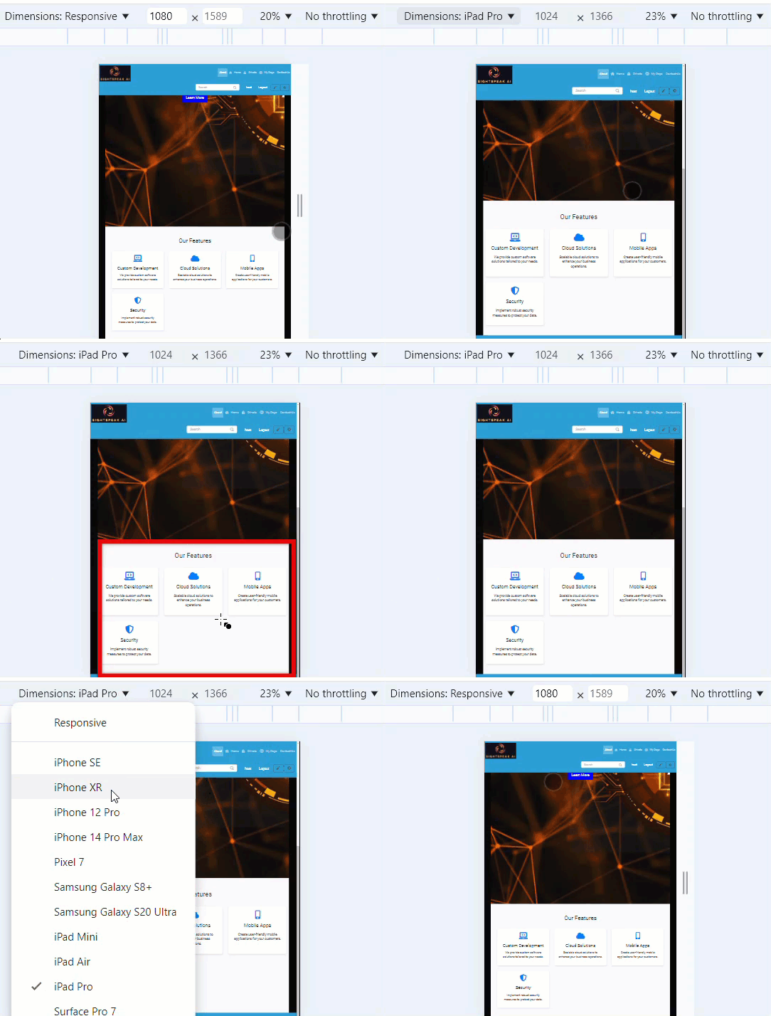
Final look in different devices like mobile & ipad:

Step 1: Add the HTML Code: "Let's start by adding the HTML code for the features section. This code creates a structured layout that includes a title and four feature items. We’re using a <section> element with the ID features and the class features-section to wrap the entire section. Inside, we have a container <div> that holds the section title and a grid of feature items."
<section id="features" class="features-section">
  <div class="container">
    <h2 class="section-title">Our Features</h2>
    <div class="features-grid">
      <div class="feature-item">
        <i class="feature-icon fas fa-laptop-code"></i>
        <h3 class="feature-title">Custom Development</h3>
        <p class="feature-description">We provide custom software solutions tailored to your needs.</p>
      </div>
      <div class="feature-item">
        <i class="feature-icon fas fa-cloud"></i>
        <h3 class="feature-title">Cloud Solutions</h3>
        <p class="feature-description">Scalable cloud solutions to enhance your business operations.</p>
      </div>
      <div class="feature-item">
        <i class="feature-icon fas fa-mobile-alt"></i>
        <h3 class="feature-title">Mobile Apps</h3>
        <p class="feature-description">Create user-friendly mobile applications for your customers.</p>
      </div>
      <div class="feature-item">
        <i class="feature-icon fas fa-shield-alt"></i>
        <h3 class="feature-title">Security</h3>
        <p class="feature-description">Implement robust security measures to protect your data.</p>
      </div>
    </div>
  </div>
</section>
"Each feature is represented by a <div> with the class feature-item. Inside, we have an icon using the <i> tag, a title inside an <h3> tag, and a description inside a <p> tag. These elements give us a clean and organized way to present our features." Before we style the features section, make sure your CSS file is linked properly in your HTML document using the <link> tag.
Step 2: Next, you may need to style the features section using the following CSS. This will make certain that your section is visually appealing and responsive.
.features-section {
  padding: 60px 0;
  background-color: #f8f9fa;
}

.section-title {
  text-align: center;
  font-size: 32px;
  margin-bottom: 40px;
  color: #333;
}

.features-grid {
  display: grid;
  grid-template-columns: repeat(auto-fit, minmax(250px, 1fr));
  gap: 30px;
}

.feature-item {
  background-color: #fff;
  border-radius: 8px;
  padding: 20px;
  text-align: center;
  box-shadow: 0 4px 8px rgba(0, 0, 0, 0.1);
}

.feature-icon {
  font-size: 40px;
  color: #007bff;
  margin-bottom: 20px;
}

.feature-title {
  font-size: 24px;
  margin-bottom: 15px;
  color: #333;
}

.feature-description {
  font-size: 16px;
  color: #666;
}

/* Responsive Design */
@media (max-width: 768px) {
  .features-grid {
    grid-template-columns: 1fr;
  }
}
Explaining CSS: Now, let's move on to the CSS. Starting with the .features-section, we’re adding padding: 60px 0; to give space around the section, and setting a light grey background color using background-color: #f8f9fa;. This helps differentiate the section from the rest of the page.
For the section title, the class .section-title centers the text with text-align: center; and gives it a large font size of 32px to make it stand out. We also set the color to a dark grey with color: #333;, which provides good contrast against the background.
To arrange the feature items, we use a grid layout with the .features-grid class. The display: grid; property allows us to create a flexible grid. We’re using grid-template-columns: repeat(auto-fit, minmax(250px, 1fr)); to ensure the grid adapts to the screen size, with each column having a minimum width of 250px. The gap: 30px; property adds space between the items.
Each feature item is styled with a white background using background-color: #fff;, rounded corners with border-radius: 8px;, and a subtle shadow with box-shadow: 0 4px 8px rgba(0, 0, 0, 0.1);. These styles create a clean and modern look. We also added padding and centered the text to make the content inside each feature item look balanced and aligned.
CSS for .feature-icon, .feature-title, and .feature-description. : For the icons, the .feature-icon class sets a font size of 40px and gives them a blue color using color: #007bff;, which matches Oqtane's branding. The title, styled with the .feature-title class, has a font size of 24px and a dark grey color for emphasis. Finally, the description text is styled with .feature-description, using a lighter grey color with color: #666; and a smaller font size to differentiate it from the title.
To ensure our features section looks great on all devices, we added a media query. When the screen width is 768px or less, the grid layout changes to a single column with grid-template-columns: 1fr;. This makes the feature items stack vertically, ensuring they remain readable and well-organized on smaller screens like tablets and mobile phones.
Step 3: Ensure FontAwesome is Included: The icons inside the features section use FontAwesome. If you haven't already included FontAwesome on your Oqtane site, you can do so by way of adding the following line to your web page's header:
<link rel="stylesheet" href="https://cdnjs.cloudflare.com/ajax/libs/font-awesome/5.15.3/css/all.min.css">
Conclusion: And that’s it! You've now created a simple and responsive features section in your Oqtane website. This section will look good on all devices and enables you show off what makes your products or services stand out. Thank for reading, Stay tuned for such interesting blogs in future with SightSpeak AI.